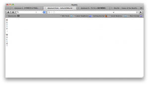
A few steps forward: the tab titles, menus, etc. are no longer vertical, though the address bar still is, and the glyphs are centered on a vertical “base” line. For Japanese that doesn’t make much difference, but Latin script as in this example looks much better than in the previous version, where the glyphs were all left-aligned.
I need to find out a lot more about typographical conventions in vertical text. What happens about underlining, for example?
